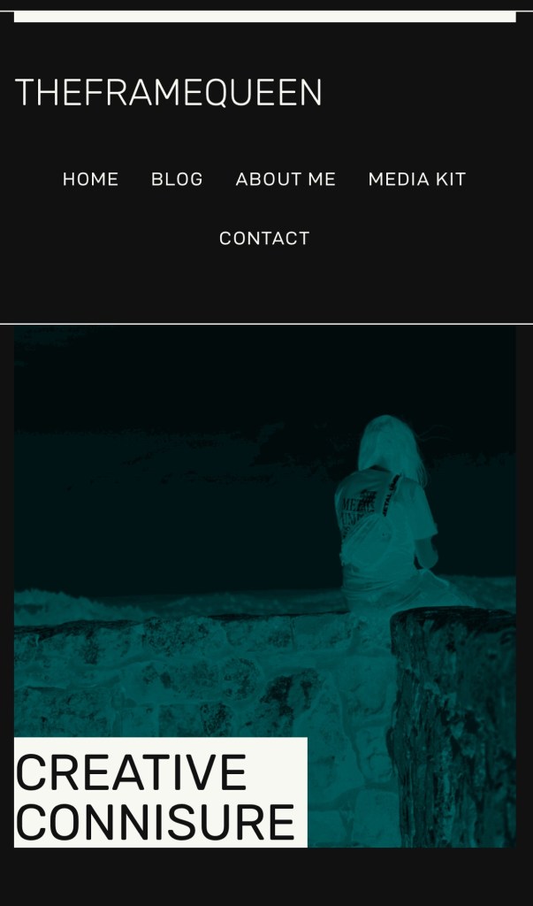
Hey everyone! as you can see things around here have changed visually and structurally, as i shifted to a full dark mode site for my site and wanted to go over a few reasons why I chose to have dark mode enabled for theframequeen.com before i published anything else 😀
With its sleek aesthetic appeal and functional advantages, dark mode has become a staple feature in many digital interfaces. In this blog, we will explore the reasons behind the increasing popularity of dark mode and its numerous benefits.
Lately, it seems like everyone’s talking about dark mode and light mode. On tons of apps and sites nowadays, you can flip between these cool themes whenever you want. Lots of folks still dig the classic light mode, but there’s a growing trend towards dark mode – a real winner if you’re the type who spends hours lost in blogs or deep articles. (myself)
Dark mode flips things up with this sleek look: think dark backgrounds teamed up with bright text. It’s not just about style; this setting is super handy in dim rooms since it cuts down on glare and eases off that harsh blue light from screens. This means less eye strain which could save you from headaches and make marathon reading sessions way more comfy.
When diving into online reads, many are finding that dark mode makes texts pop more dramatically against its moody backdrop—it practically hooks attention better, making stories jump out at you for a totally gripping read.
And there’s another bonus—dark mode can be easier on your gadgets too! Devices with OLED screens really lap it up because they suck less power displaying darker colors. So switching over to dark mode could mean your battery lasts longer before needing a charge—less plugging in equals more uninterrupted reading time!
Choosing between these modes boils down to personal taste ultimately; however, considering how soothing and energy-saving dark mode is, especially if you love burying yourself in digital pages for hours—it’s definitely worth checking out.
Next time you’re settling in for some screen-time storytelling or article binging why not try switching to dark mode? You might just find it adds an awesome new dimension to your binge-reading sessions—an unexpected plus sparking even deeper enjoyment!
TLDR/ pros and cons
Dark Mode:
Pros:
- Reduced Eye Strain: Dark mode can be easier on the eyes, especially in low-light conditions, as it reduces the amount of bright light emitted by the screen.
- Better for OLED Screens: Dark mode can extend battery life on devices with OLED screens, as black pixels consume less power than white ones on such displays.
- Enhanced Readability: Some users find that text and graphics are more readable on a dark background, particularly for long periods of reading.
- Aesthetically Pleasing: Many users prefer the sleek and modern look of dark mode, especially in apps and interfaces that support it well.
- Reduced Distractions: Dark mode can help reduce visual distractions, particularly in dimly lit environments, allowing users to focus more on content.
Cons:
- Limited Compatibility: Not all apps or websites support dark mode, which can lead to inconsistent experiences across different interfaces.
- Color Accuracy: Dark mode may not accurately represent colors in images or videos, as it can alter the perceived contrast and saturation.
- Accessibility Concerns: Dark mode may not be suitable for users with certain visual impairments or conditions, as it can make content harder to see for some individuals.
- Daytime Usage: Some users find dark mode less suitable for daytime use, particularly in bright environments, where it may cause glare or reflections on the screen.
- Adaptation Period: Switching between dark and light modes can take some time for users to adjust, and some people may find it initially disorienting or uncomfortable.
Light Mode:
Pros:
- Standard Interface: Light mode is the default interface for most devices and platforms, ensuring consistent experiences across different apps and websites.
- Accurate Color Representation: Light mode typically provides more accurate color representation for images and videos, as it closely resembles printed media and real-world lighting conditions.
- Accessibility: Light mode may be more accessible to users with certain visual impairments or conditions, as it provides higher contrast between text and background.
- Daytime Visibility: Light mode is generally easier to see in bright environments, such as outdoors or well-lit rooms, where dark mode may cause glare or reflections.
- Familiarity: Many users are accustomed to light mode interfaces and may prefer them for their familiarity and ease of use.
Cons:
- Eye Strain: Light mode can cause eye strain, especially when used in low-light conditions, as it emits more bright light compared to dark mode.
- Battery Life: Light mode may consume more battery power on devices with OLED screens, as white pixels require more energy than black ones on such displays.
- Distractions: Light mode interfaces can be visually distracting, particularly in dimly lit environments, where the brightness may be uncomfortable for some users.
- Sleep Disruption: Exposure to bright light from light mode screens, particularly before bedtime, can disrupt sleep patterns and affect overall sleep quality.
- Glare and Reflections: Light mode may produce glare and reflections on the screen, particularly in outdoor or highly illuminated environments, making it harder to see content.
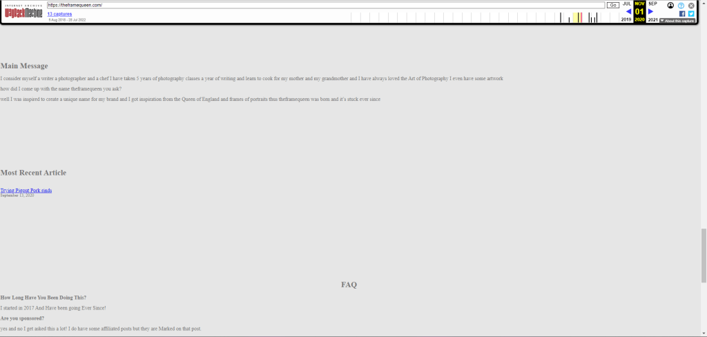
Below as you can see a few examples that my website had prior to enabling dark mode and restructuring, as you can see there is lots of empty space and it is harsh on the eyes it’s also pretty incomplete.


Happy reading : )

Join the conversation or start one!